Five Years of Design Language Evolution
From an MVP built in Adobe XD through to a modern, documented, shared design system spanning brand, product and content. Five years of decisions that mapped almost exactly to So Energy's own growth.
Where it started
When I joined So Energy in 2020, a rebrand was already underway. Studio Blackburn, the agency behind it, had produced a visually bold identity – bright primary colours, all-caps display typography, and a deliberately differentiated aesthetic in a category where most suppliers look the same. Commercially, the brief made sense. Practically, implementing it as a usable, accessible digital product was another matter.
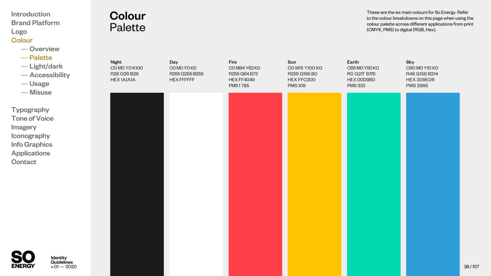
The brand palette led with red, green, yellow, and blue – each of which carries established meaning in UI design (error, success, warning, information). Before a single component was built, there were fundamental colour conflicts to navigate, and the agency's designs showed little consideration of accessibility contrast ratios, information hierarchy, or mobile usability.
Rather than push back on the brand identity itself, we built an evidence base. Working with our design lead and researcher, we ran a programme of usability testing and first click studies comparing the proposed rebrand against the existing site. Findings were consistent: the bold, stylised approach read as aggressive and distracting for many users, CTA clarity suffered under the visual load, and colour accessibility was a genuine barrier. We documented these as formal UX recommendations and shared them with the agency, resulting in meaningful adjustments to the direction.
V1 – foundations over decoration (2020)
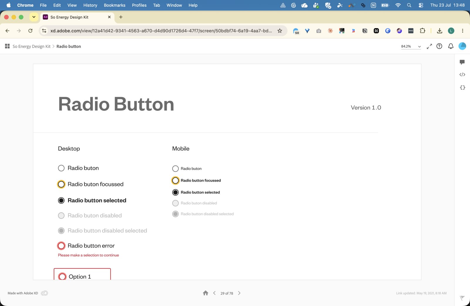
With a tight timeline, no CMS, and a small engineering team working in hard-coded templates, the priority for v1 was to establish a solid, accessible foundation rather than a visually ambitious one. I built the first design system from scratch in Adobe XD, drawing on Government Design System principles as a reference: high contrast, clear component states, minimal decoration.
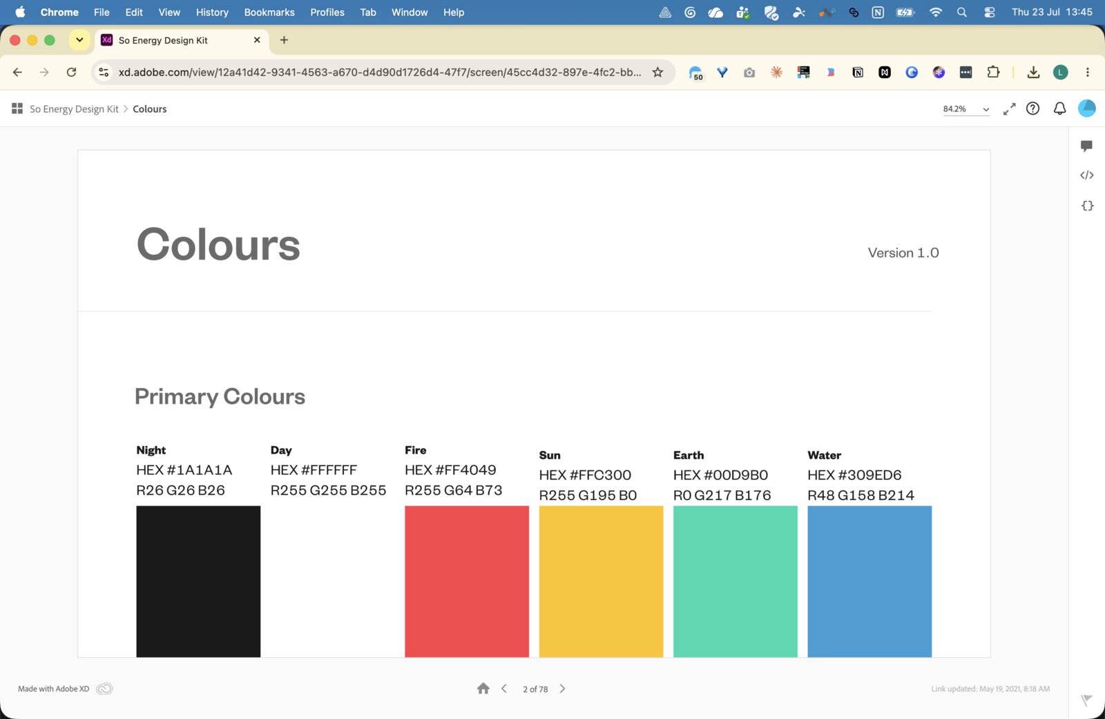
The decision to keep v1 deliberately restrained was intentional. Rather than translate a complex brand palette directly into UI, we stripped back to black, white, and key brand highlights – using the bold typographic and colour identity for marketing surfaces while keeping product UI clean and functional. This established a split between expressive (marketing) and productive (product) design language that would carry through every subsequent iteration.
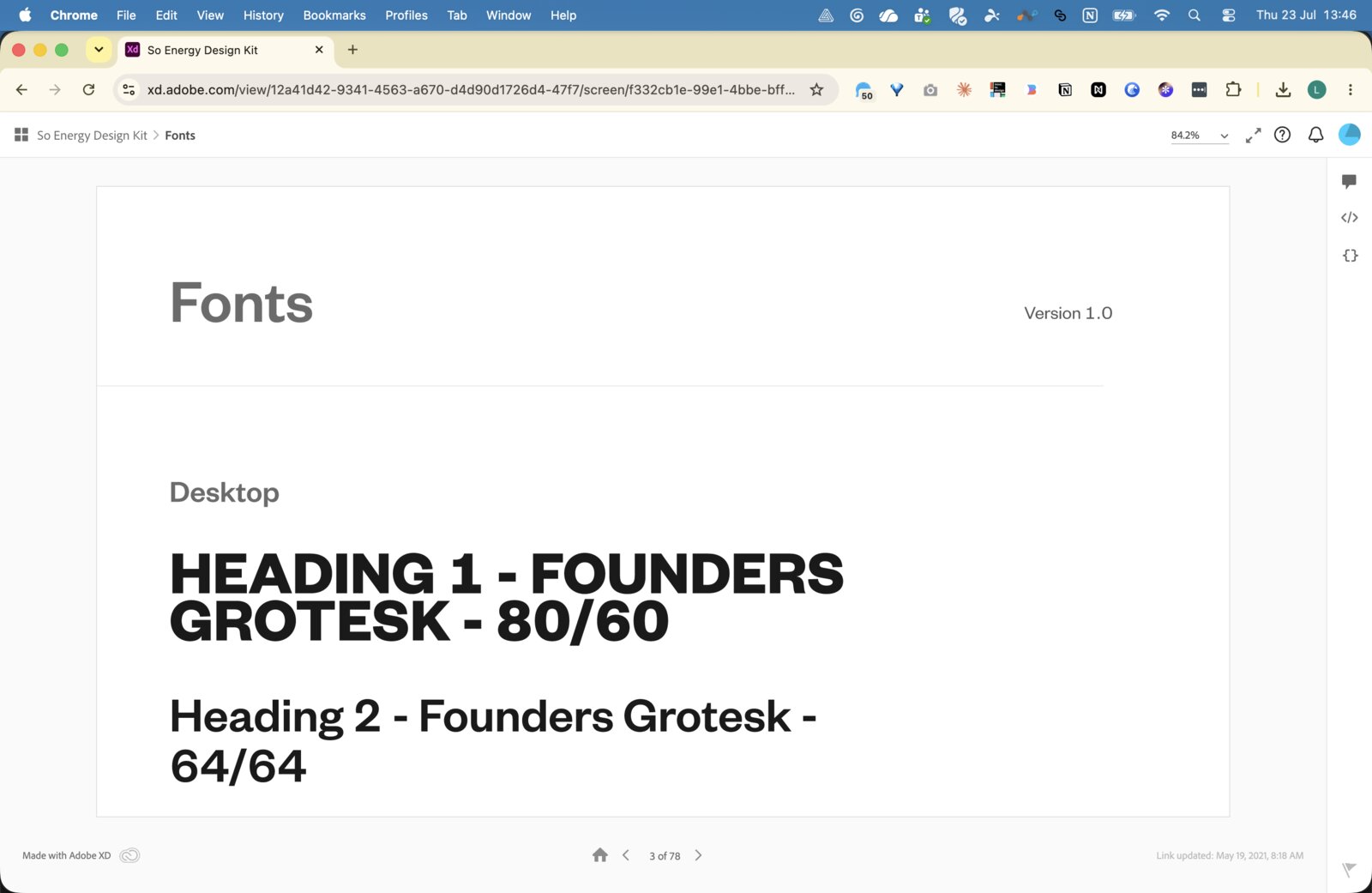
The v1 system covered colours, typography, spacing, icons, and core interactive components, giving the engineering team a consistent reference and – critically – one that was buildable without ambiguity or inaccessible colour pairings.
V2 and V2a – mobile-first and visual maturity (2022 – 2023)
By 2022, with a fellow product designer now in the team, v1 clearly needed to evolve. Usage data confirmed what we suspected: the majority of customers were on mobile, and the v1 components hadn't been designed with touch interfaces as a primary consideration.
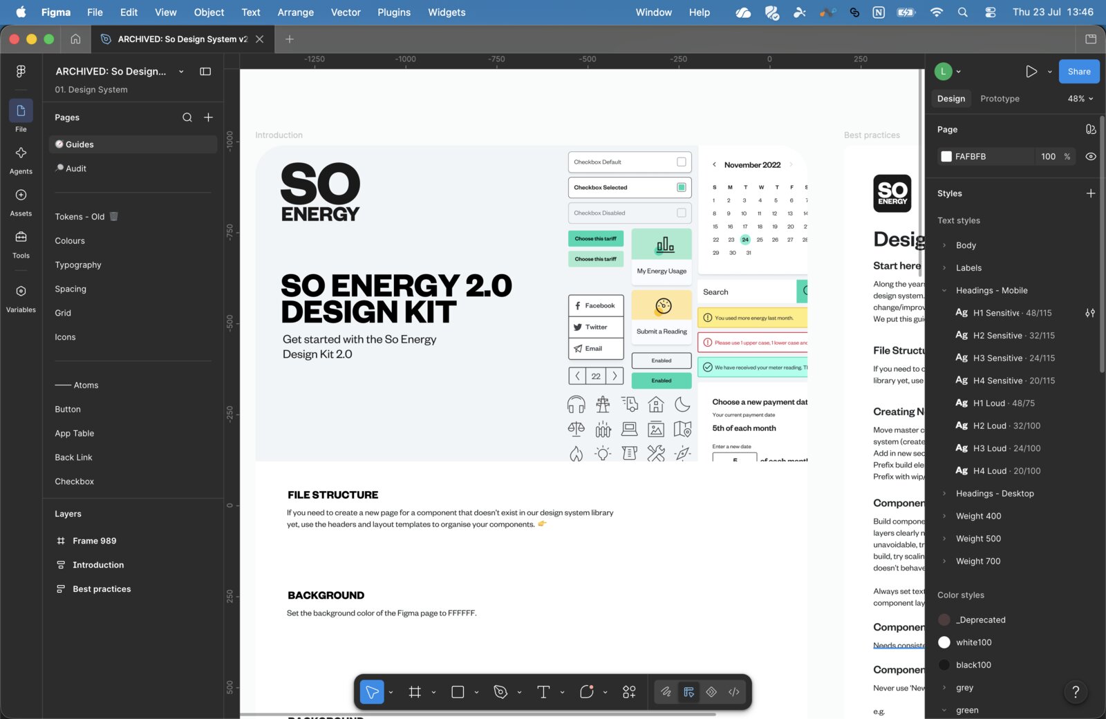
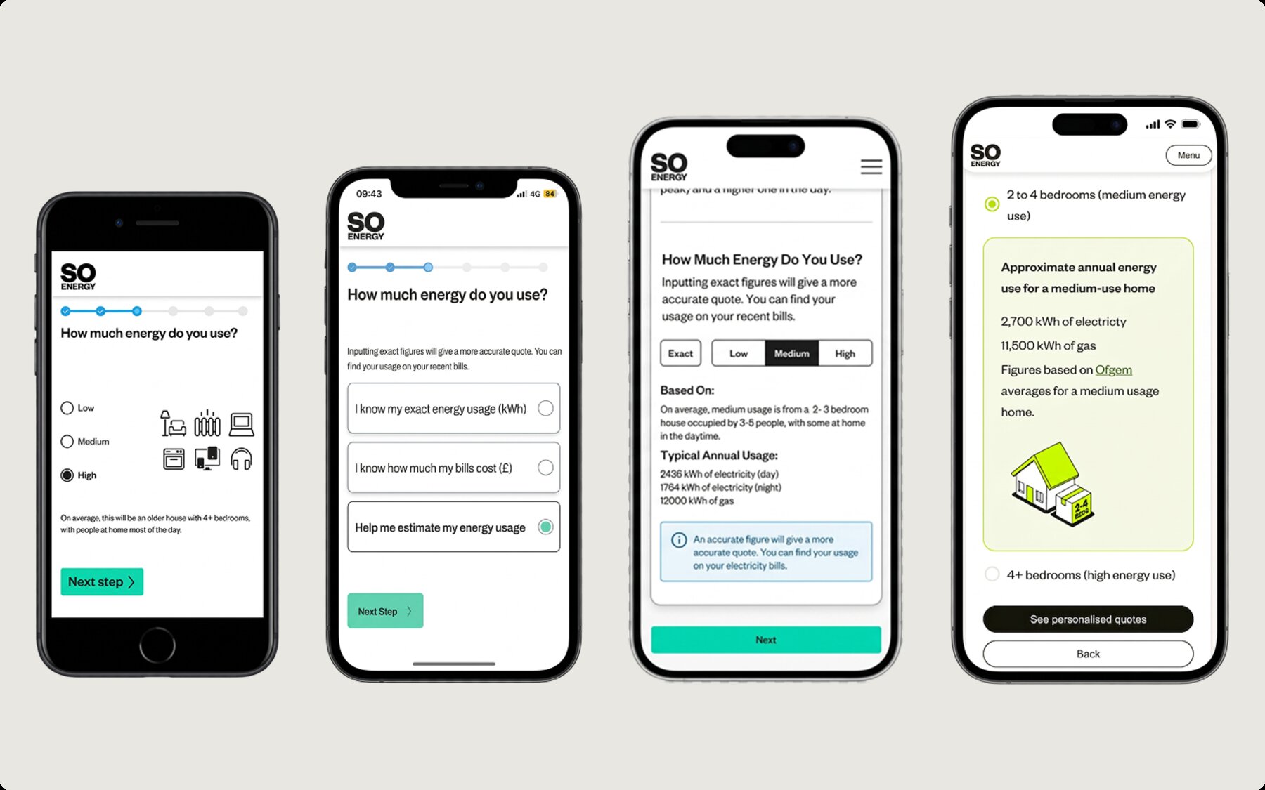
V2 introduced a more deliberate mobile-first approach – larger touch targets, revised spacing and layout grids, and components reconsidered for thumb navigation. The radio button illustrates this well: v1 followed standard desktop conventions; v2 introduced larger hit areas, clearer selection states, and better support for error and disabled conditions.
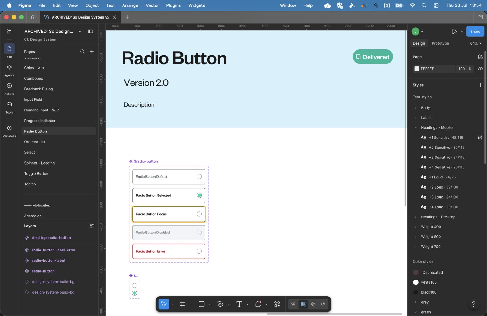
The typography system was also formalised more explicitly at this stage. The all-caps display headings worked on marketing pages but were demonstrably harder to read in product contexts – backed by our earlier usability research. We established two distinct type scales: an expressive set for marketing and brand moments, and a productive set for product and account interfaces. This distinction has remained a cornerstone of the system ever since.
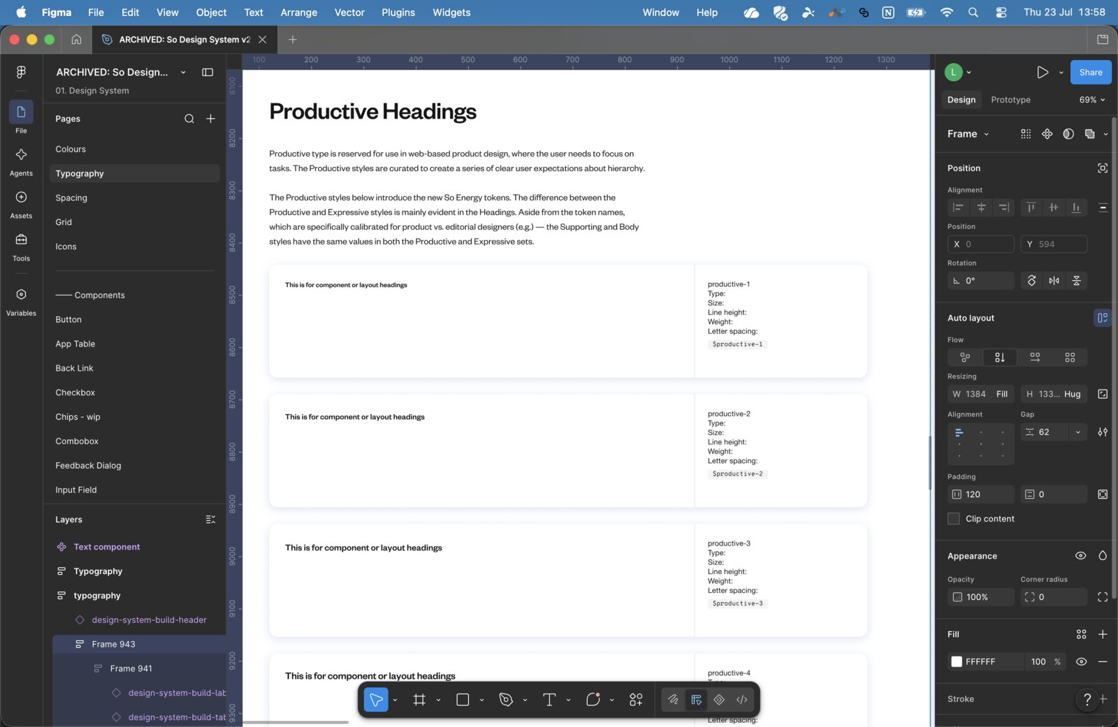
V2a emerged organically as we began preparing for a broader account redesign, with components shifting toward a cleaner black-and-white foundation. This gave the system more visual adaptability and pre-empted the brand refresh already on the horizon, stepping back from direct brand colour in UI components to reduce visual noise and improve consistency.
V3 / Nexus – brand refresh and shadcn alignment (2024)
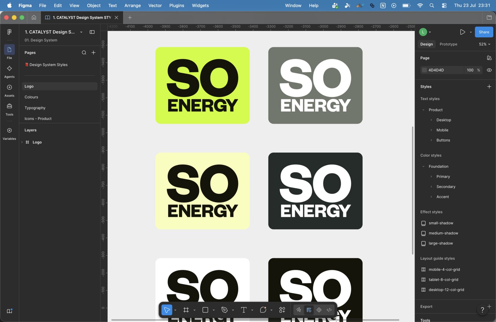
The 2024 brand refresh – again led by Studio Blackburn – brought a significant visual shift: the electric lime green replaced the earlier palette, the overall aesthetic became more minimal and modern, and the product and marketing visual languages began to converge. This was the trigger for v3.
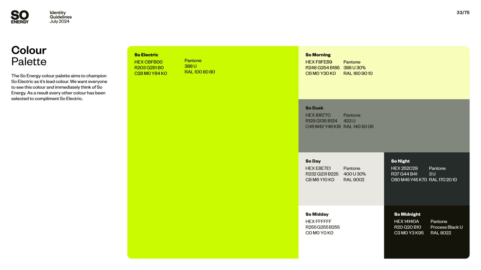
A significant decision that shaped v3 was an engineering one: the new customer account front end was being rebuilt in shadcn. Rather than continue building components from scratch, I advocated for adopting the shadcn Figma library as the foundation for v3. This aligned the design system directly with the engineering stack for the first time, significantly reducing the gap between designed and built, and cutting the component overhead for new additions.
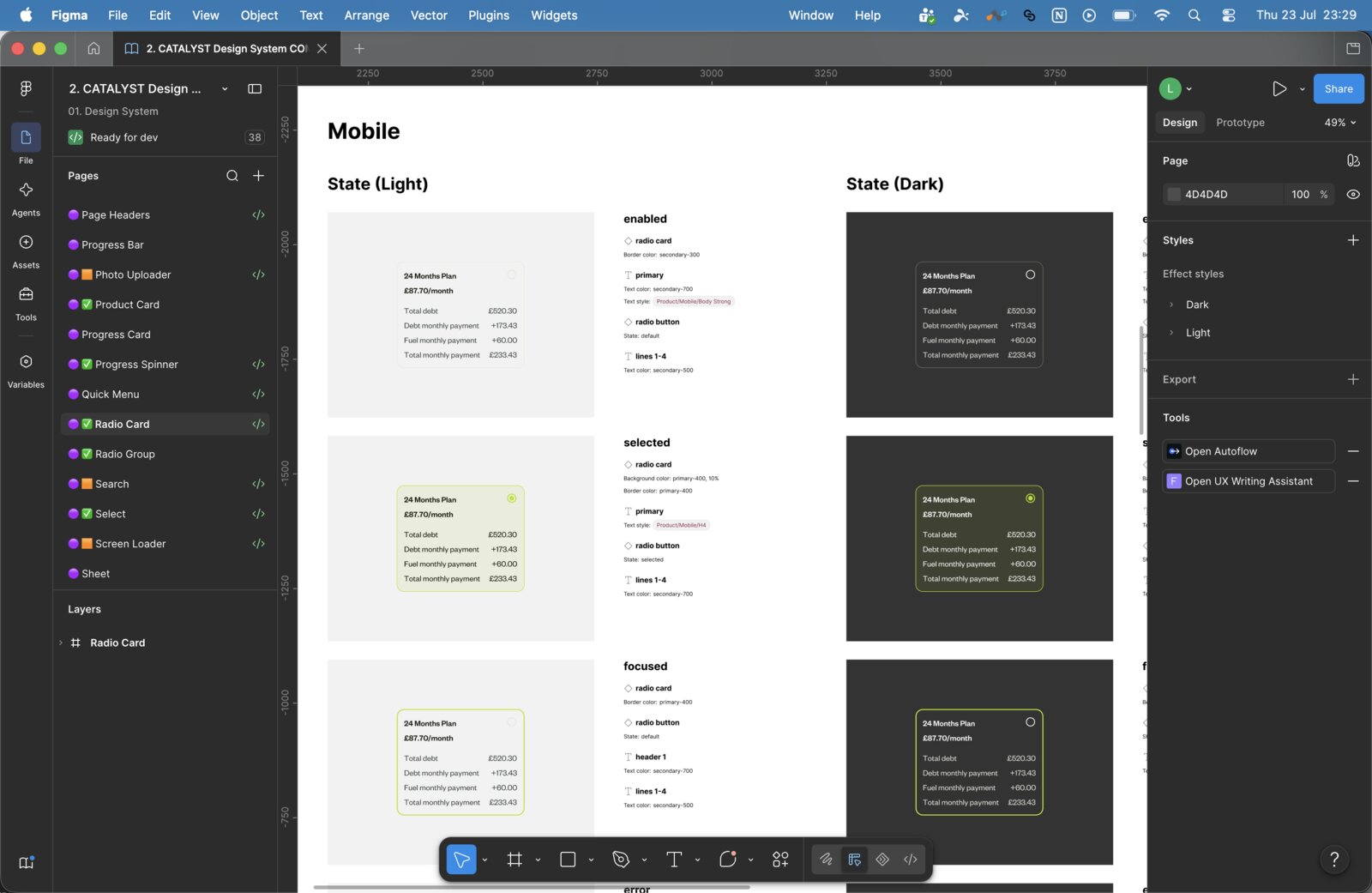
The visual design for v3 was led by the other Product Designer in the team, who carried out the majority of the Figma implementation. My role was strategic direction and oversight – defining the approach, making the shadcn decision, ensuring alignment with the brand refresh, and reviewing the work as it developed.
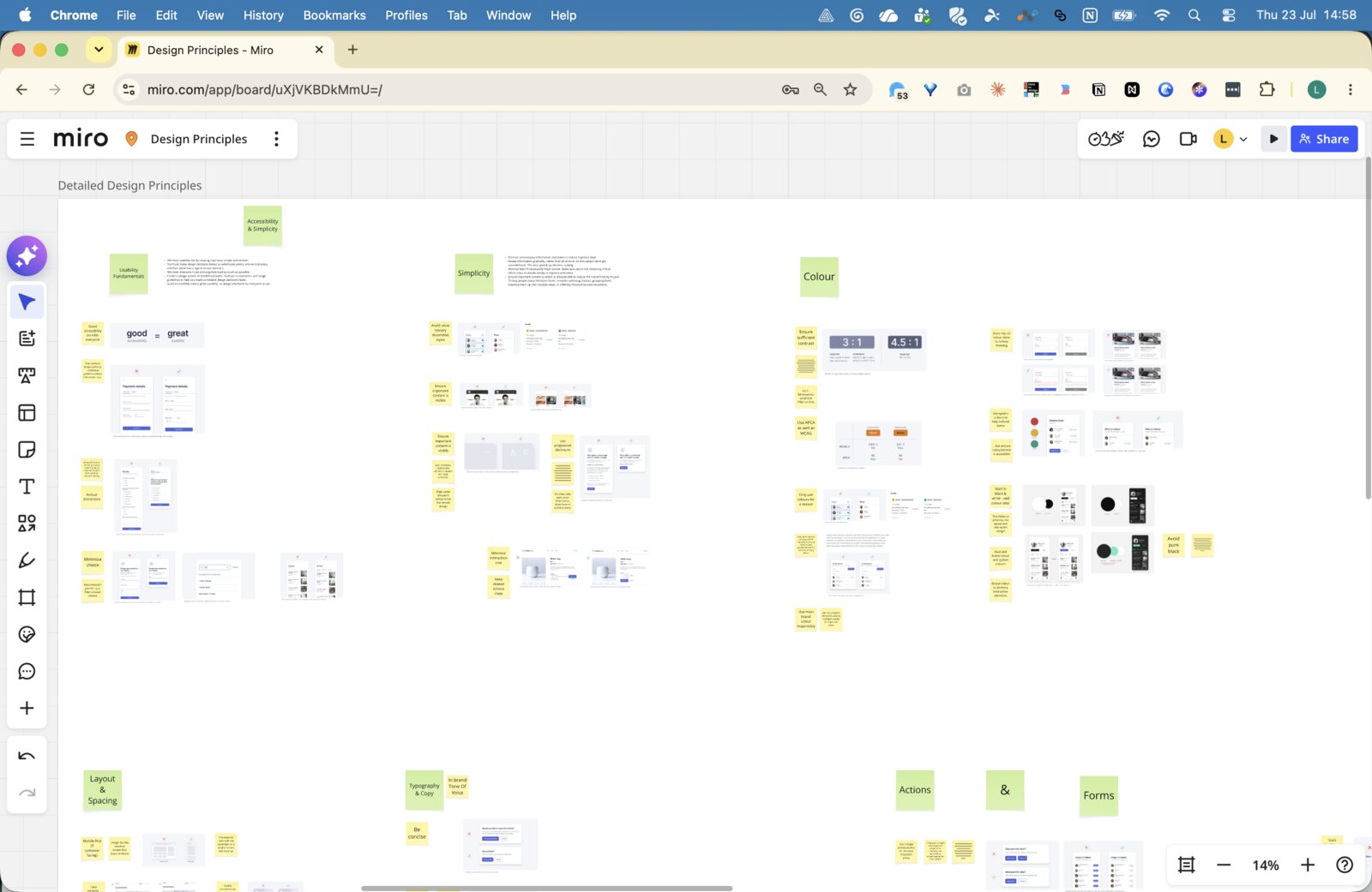
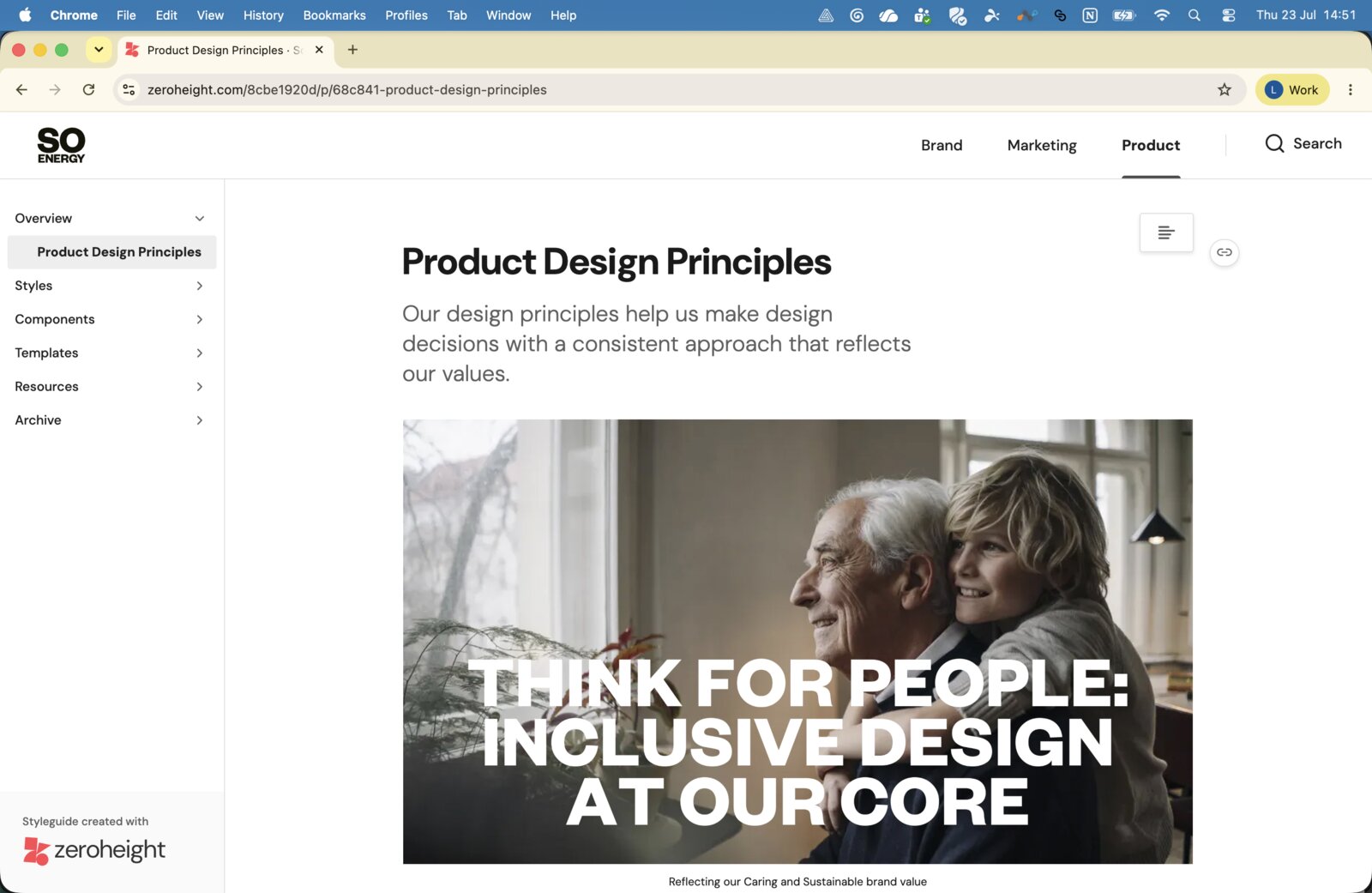
In parallel, I facilitated a design principles workshop in Q4 2024 to update our principles, which had become outdated since 2020. Working through ideas collaboratively in Miro, then synthesising in Claude, we produced a set of updated principles tied directly to So Energy's brand values – Think for People (inclusive design), Grow Trust Through Design (clarity and honesty), and others. These now open our Zeroheight documentation.
Zeroheight – from system to shared resource (2025–ongoing)
For most of its life, the design system's value was largely internal to the design team. Component documentation existed in Figma, but not in a form that Product, Engineering, Marketing, or external partners could easily reference or act on independently.
Zeroheight changed that. We built out a structured documentation hub covering Product Design Principles, Styles, Components (with usage guidance and do/don't examples), Templates, and Resources, launching first to the Product and Engineering teams internally. Adoption was quick, and appetite from Marketing and Brand to be included has been strong – extending the hub to cover brand assets and marketing guidelines is the clear next step.
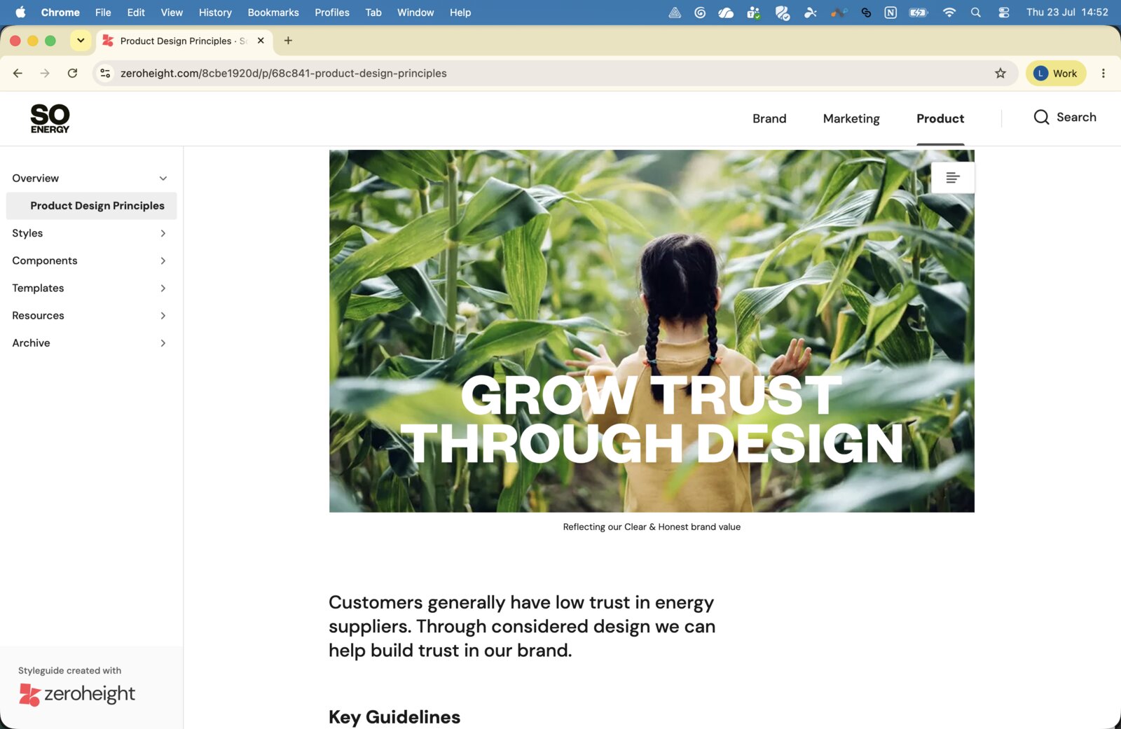
A significant part of the system's value has come from content integration. Our content writer developed a comprehensive UX-focused content guide, extending the original brand tone of voice guidelines into something practically useful for product design. Working together, we embedded these guidelines directly into our component documentation in Zeroheight – so usage guidance now covers both design and content in one place. These same guidelines have been used to build a content assistant in Microsoft Copilot, and inform how we prompt Claude and Claude Code to generate brand-aligned copy. The result is that consistent, on-brand content can be produced across design, engineering, and content workflows without the design team being a bottleneck.
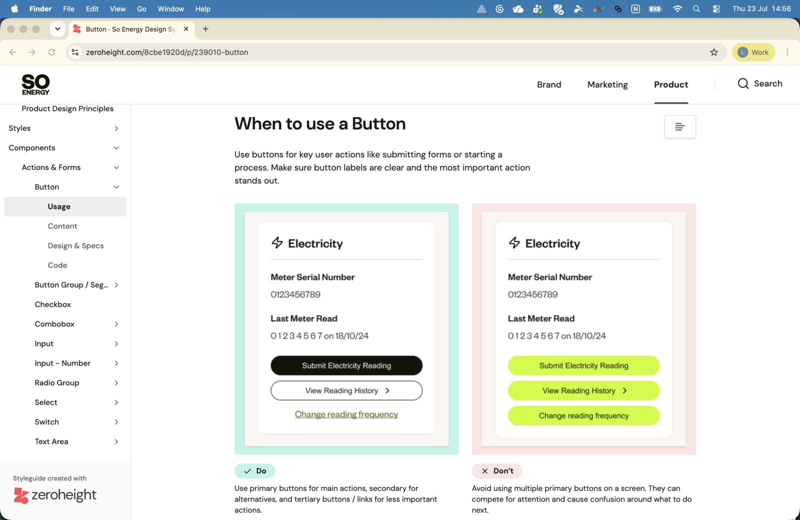
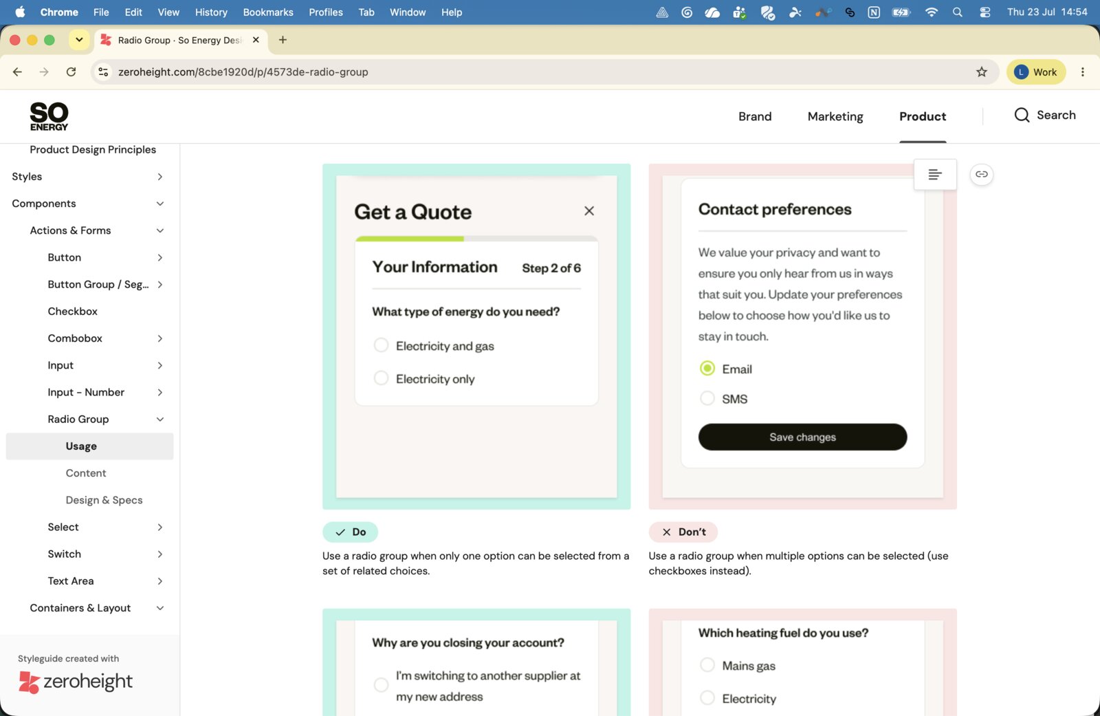
The system also brings value when partners work with us – ensuring their output is brand-aligned without requiring a separate design handoff each time. Longer term, once the Marketing and Brand sections are complete, the plan is for Zeroheight to live on a dedicated public URL as a single home for So Energy's entire design language, from brand values through to product components and content guidelines.
What this represents
Looked at across five years, the design system's evolution maps almost exactly to So Energy's own growth – from a startup rebrand with hard-coded templates and no CMS, through to a modern, documented design language underpinning a product used by hundreds of thousands of customers.
What hasn't changed is the underlying principle: accessibility and usability come before brand ambition. That was the argument made with evidence in 2020, and it's the argument the design system has kept making ever since.
What's changed since
Five years reflects how much So Energy itself changed over that period, not how long building a system like this inherently takes. Much of that timeline was shaped by circumstance: a startup with no CMS and a hard deadline, then a two-person team validating direction as the product itself found its feet.
That's no longer the constraint it once was. With a clear design strategy in place from the outset, component libraries like shadcn already aligned to engineering, and AI-assisted design and development tooling shortening the distance between decision and shipped code, the same foundational work – strategy, principles, a documented and adopted system – is realistic to establish in weeks or months rather than years. The five-year arc reflects the company's own growth; it isn't a ceiling on how quickly this could be done again.