Settling a loyalty-scheme debate with data, then shipping it in weeks
So Rewarding needed to reduce churn ahead of a major renewal spike - but there were competing ideas about what it should be. I led discovery to settle the debate, then moved fast through Claude-built prototypes to a shipped loyalty scheme with almost 24,000 members.
The brief
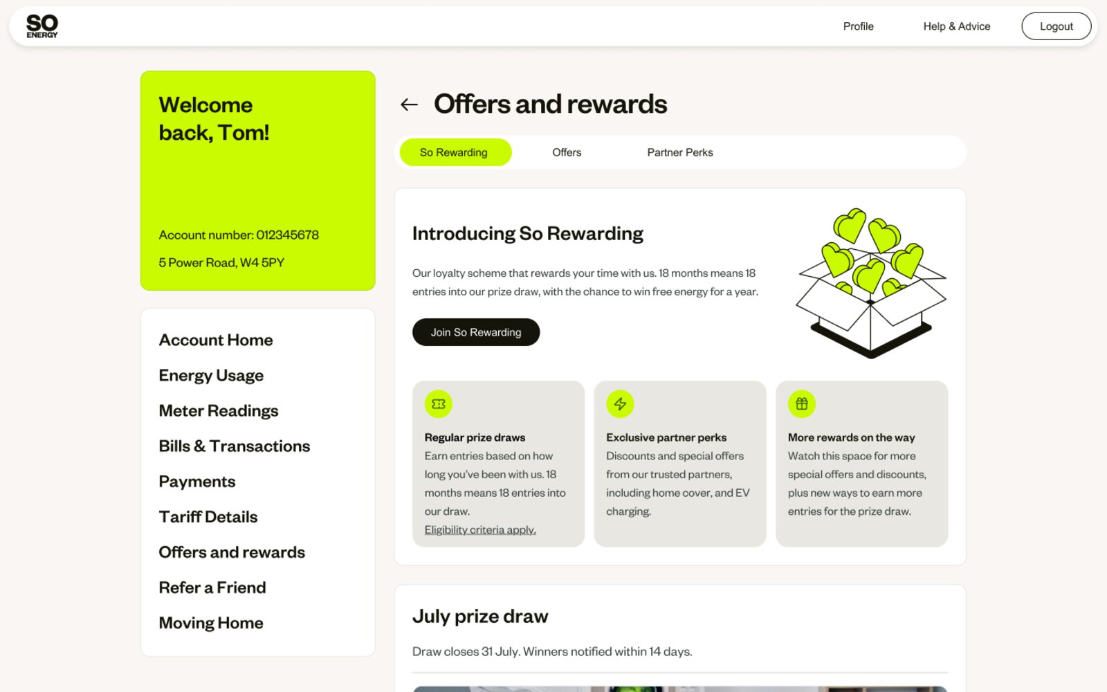
So Energy's customer retention strategy needed a loyalty proposition that could demonstrably reduce churn heading into a major renewal spike at the end of July 2026. An initial prize draw had launched in Q4 2024, giving the team some early data and learnings to build on. The ambition was to develop this into a fuller scheme – but with several competing concepts in play across Propositions, Commercial, and Marketing, the challenge was finding the right mechanic before committing to build.
I was brought onto the project to help focus scope, set up a clear and measurable experiment, and give the team the best chance of landing something within the timeframe.
Discovery – letting the data decide
Rather than jumping straight to a design direction, I started with research. A Hotjar survey launched across the customer account collected 1,500 responses in a matter of weeks, asking customers directly which loyalty mechanics appealed to them most.
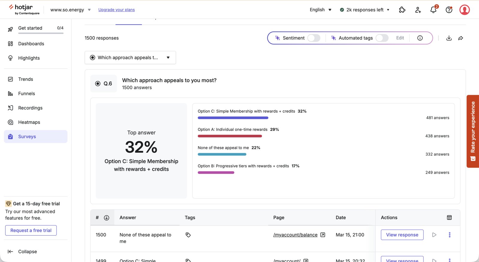
The results were clear: 32% preferred a simple membership with rewards and credits, 29% wanted individual one-time rewards, and only 17% wanted progressive tiers. Crucially, 22% said none of the options appealed – they wanted lower prices, not gimmicks.
This data confirmed that for the MLP, the right foundation was simplicity: a tenure-based prize draw with always-on benefits that customers could understand immediately. That said, it didn't rule out gamification entirely – it did appeal to a segment, and remains a candidate for later iterations as a way to boost engagement through bonus actions.
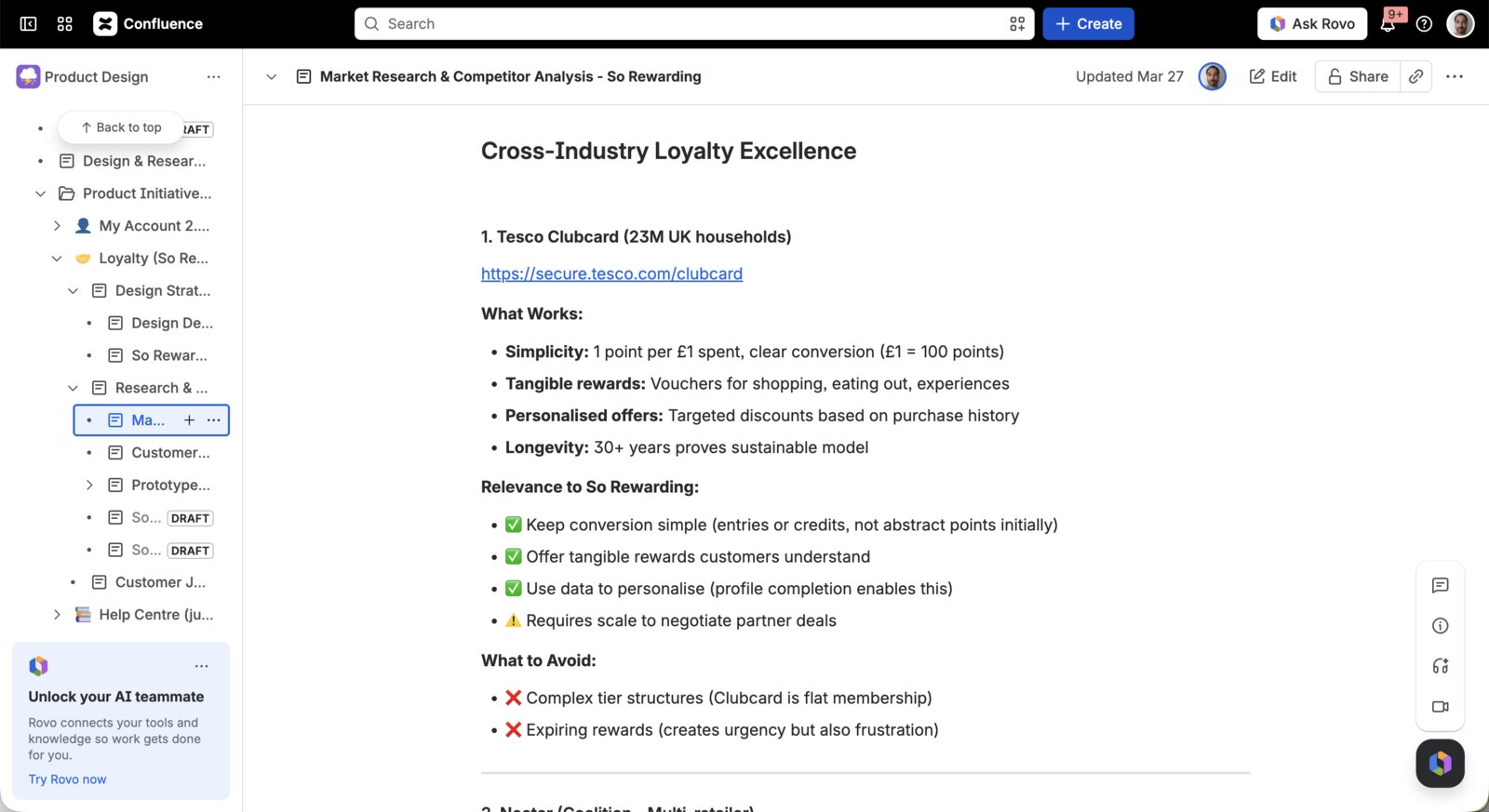
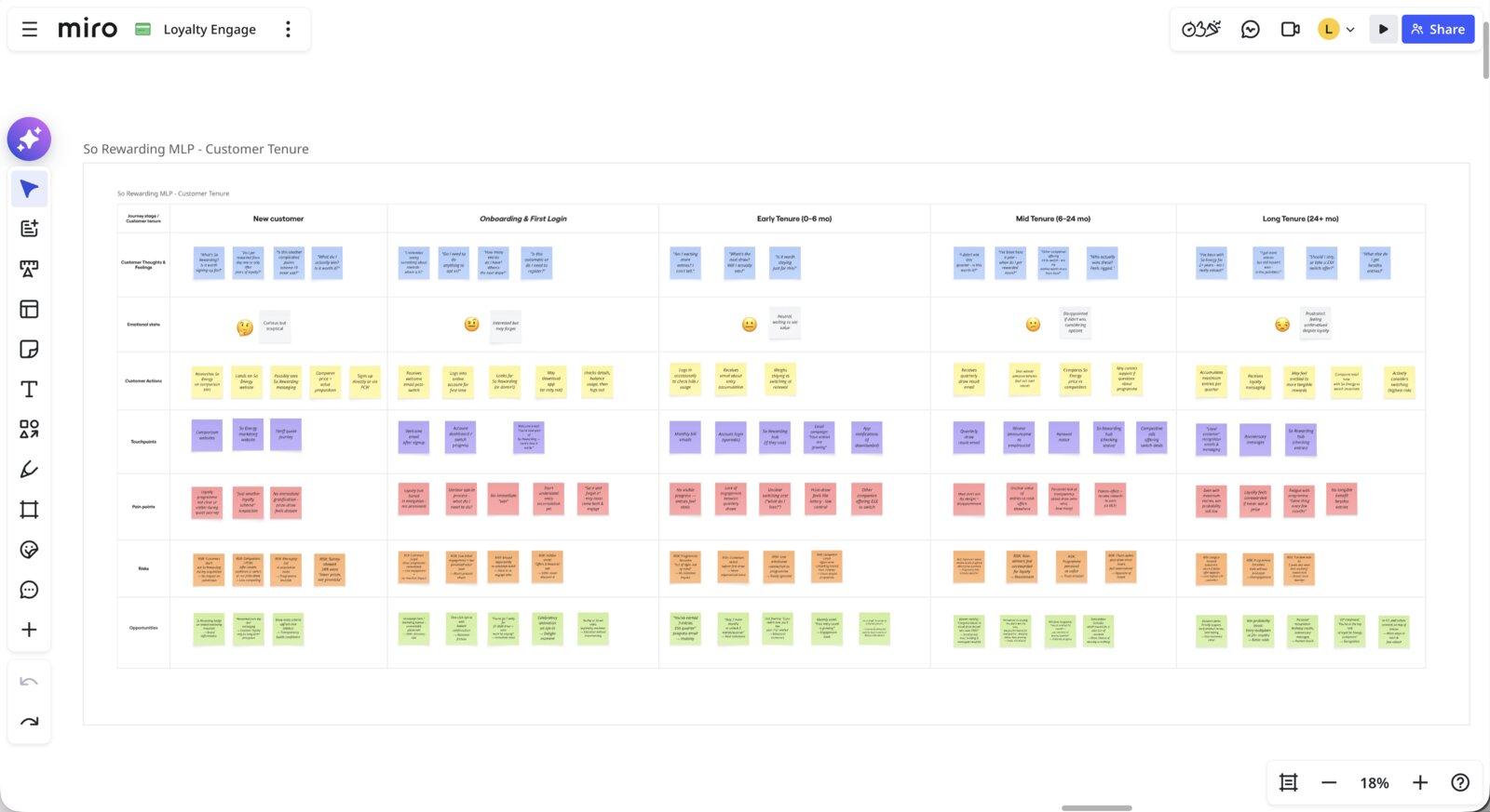
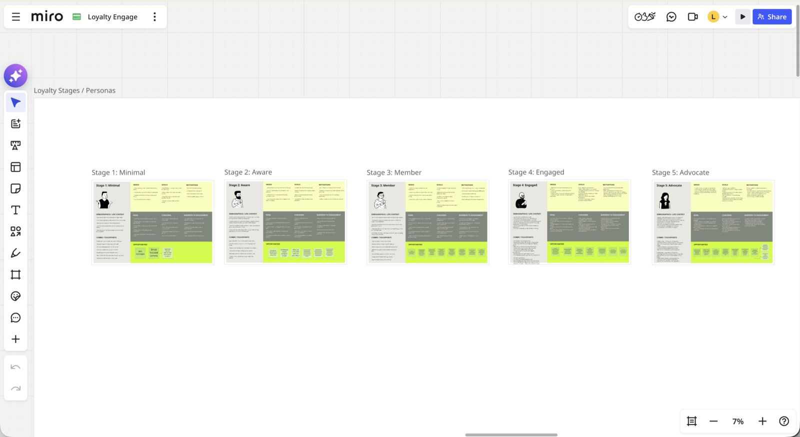
Alongside the survey, I conducted a cross-industry competitor analysis drawing on successful loyalty schemes to identify what made the best ones work and what to avoid. Using Claude accelerated the depth and breadth of this work considerably. I also refined the customer journey map into a tenure-based model covering the full customer lifecycle, and created five personas spanning loyalty stages from minimal engagement through to active advocacy – both helping to ground design decisions in a clear picture of who we were designing for.
Strategy and stakeholder alignment
Throughout the discovery phase I joined regular stakeholder sessions including SLT members closely invested in the scheme's success. Having clear data behind a simple, honest recommendation made it possible to secure alignment on an approach that reflected So Energy's values, rather than the more complex gamification mechanics that had been under discussion.
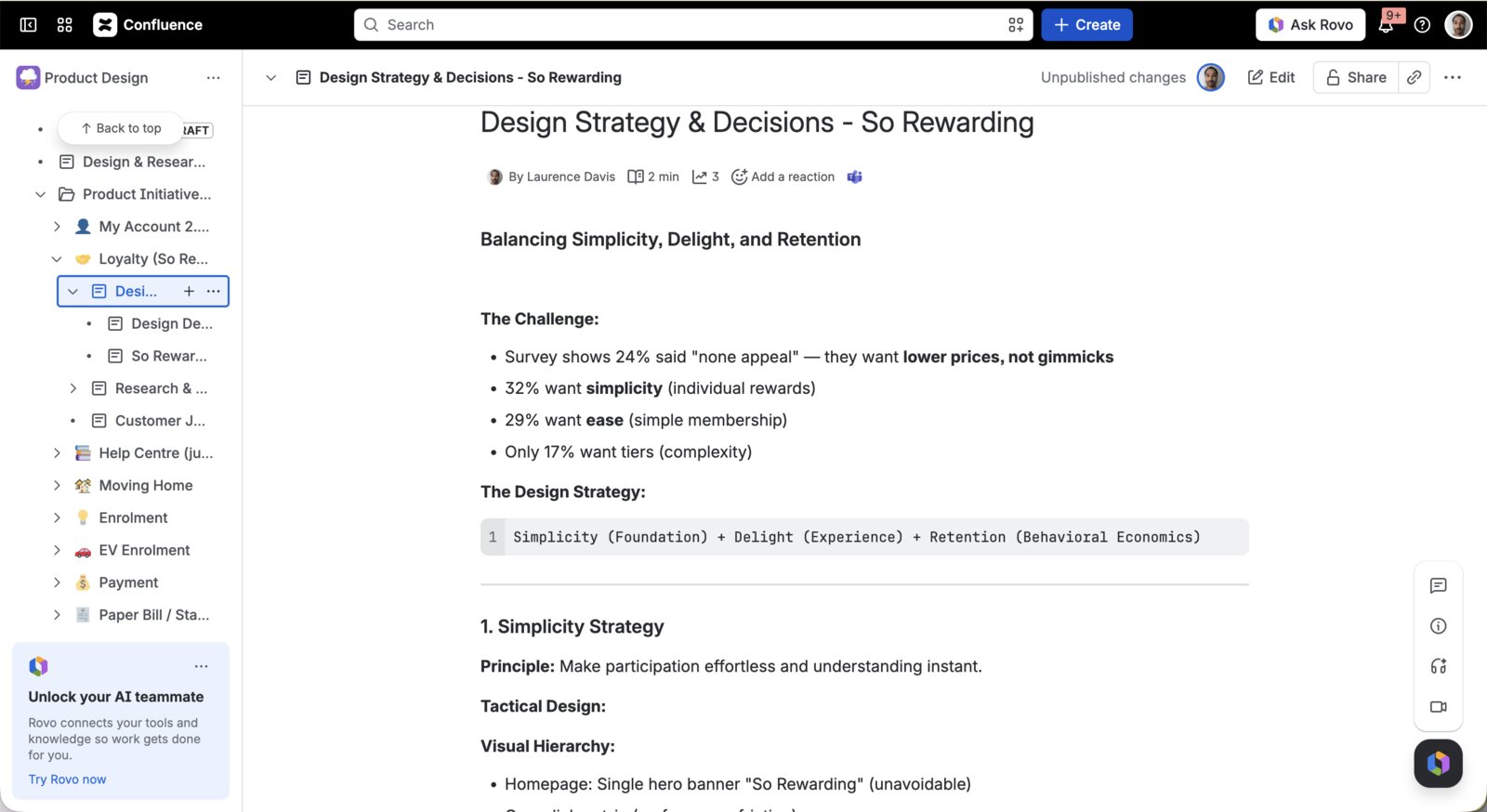
I documented this thinking in a formal design strategy, framing the initiative around three principles: Simplicity as the foundation, Delight as the experience layer, and Retention through behavioural economics. This became the reference point for design decisions throughout delivery.
Prototyping and testing
Once the direction was clear, I moved quickly into HTML prototyping – building directly in Claude rather than Figma, and deploying via Netlify so prototypes could go live for testing within an hour. Files were kept intentionally greyscale to focus participants on proposition and interactions rather than visual execution, producing higher-fidelity interactions than a linked Figma prototype would have.
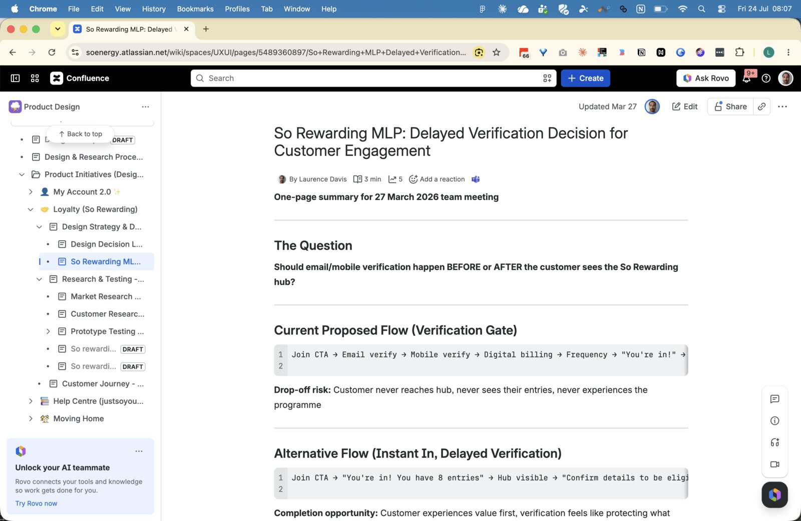
One of the more nuanced design questions was how to handle contact verification during sign-up. It was commercially important to confirm valid contact details for customers, but a full verification gate before the customer became a member potentially risked drop-offs. We explored two approaches – verification upfront versus letting customers join immediately and verifying afterwards – and tested both via Userbrain. Participants found it slightly easier to enter without verification first, but a number didn't complete the delayed step once they'd joined. Those who went through upfront verification had no real issues with it and found it consistent with similar journeys they'd experienced elsewhere. We landed on email confirmation upfront as the right balance – enough to confirm valid contact details without adding significant friction. Mobile SMS verification was considered but proved too complex to implement within the MLP timeline; it's earmarked as a future bonus action where customers can earn additional prize draw entries.
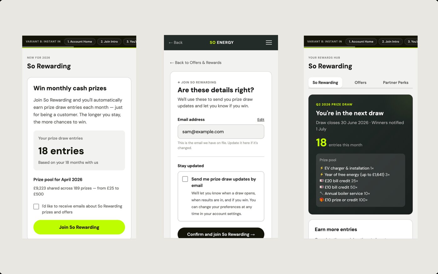
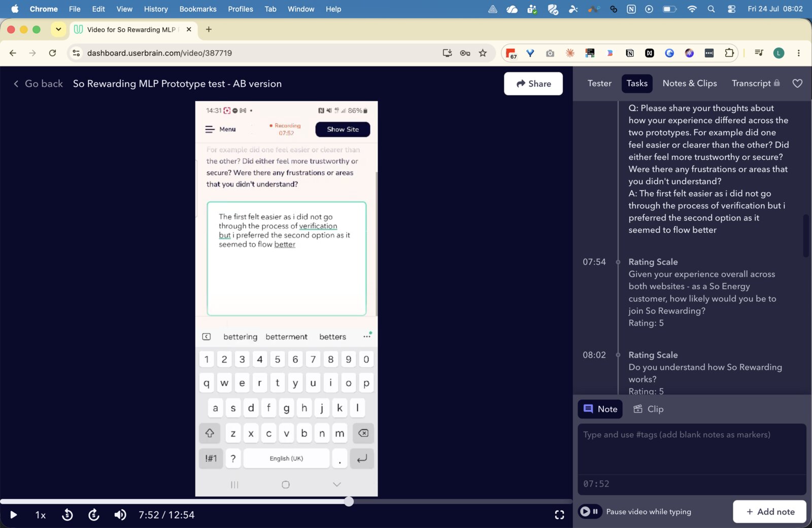
Prototypes were tested with both Userbrain panel members and So Energy customers before any visual styling was applied.
Visual design – bringing in the polish
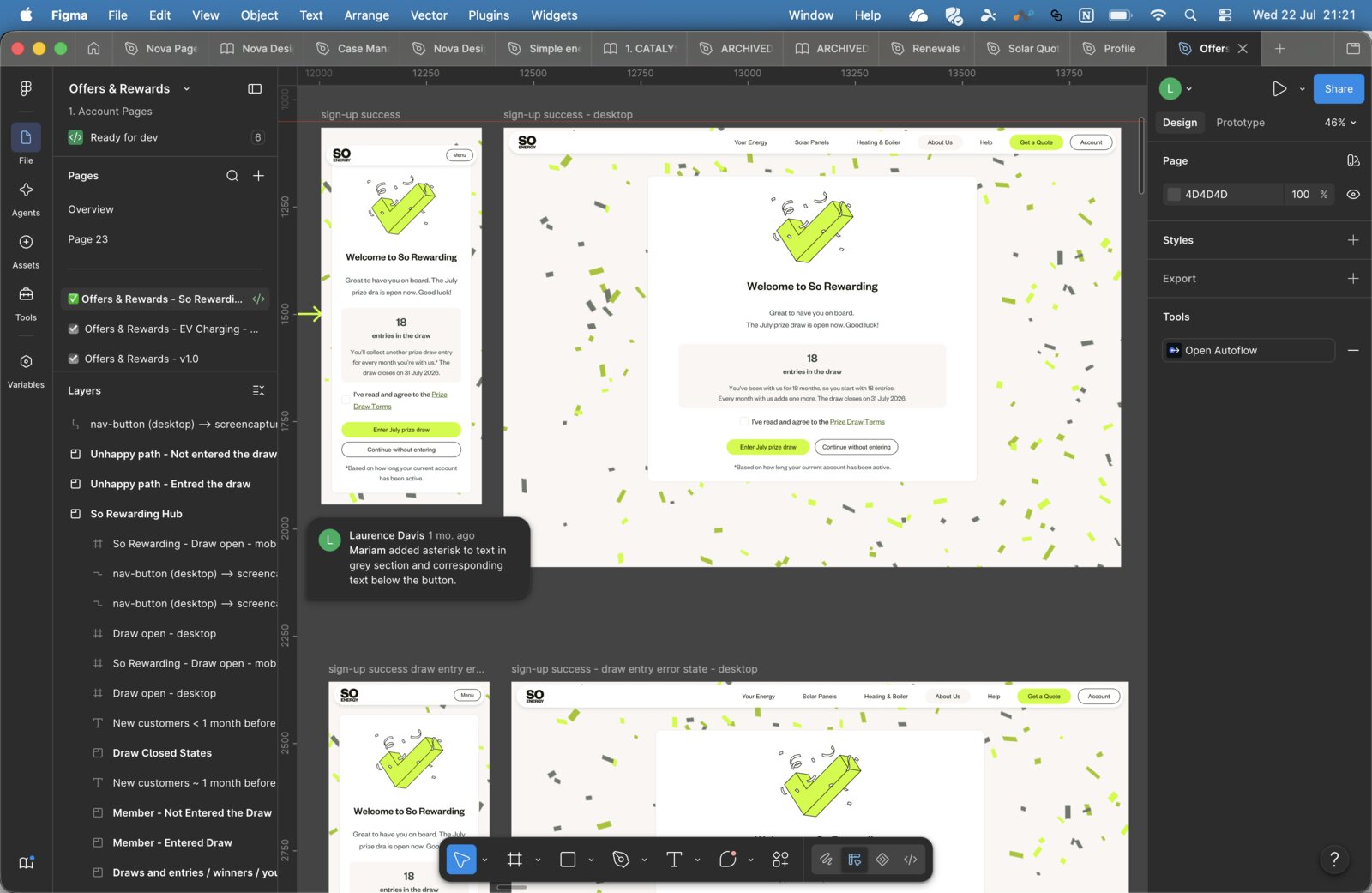
Only once journey, content, and layout were confirmed did we move to Figma. This sequencing was deliberate – visual polish as its own stage, not something that emerges gradually through the process.
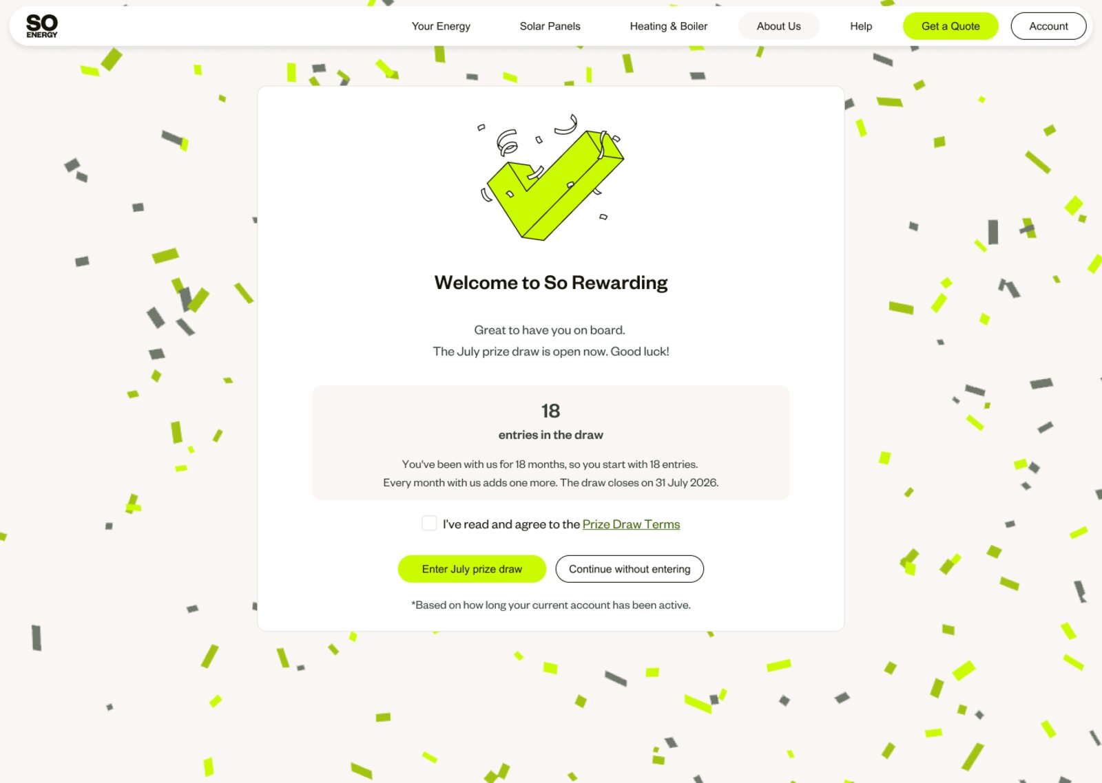
This is where I pushed for what the original brief had described as "moments of delight" – encouraging the other Product Designer not to limit ideas to existing component styles. I contributed screens and components directly alongside giving direction, and we converged at the end to refine and align everything before handoff. The sign-up success screen is a good example: a small detail, but one that turns a transactional confirmation into something that feels genuinely rewarding.
Outcomes
So Rewarding launched and has attracted almost 24,000 member sign-ups, with more joining every day. The prize draw closes at the end of July 2026, after which the team will analyse the impact on retention during the renewal spike – early signs are positive.
The proposition structure that emerged from discovery – simple, tenure-based, honest about what members get – reflects the values So Energy is built on. No badges, no points walls, no mechanics designed to obscure value. Just a clear answer to the question every customer asks of a loyalty scheme: what do I actually get?
What I learned
The most valuable thing I did on this project was the discovery phase. The research and insights gathered at the start gave us objective data at a moment when multiple teams had competing opinions about what the scheme should be. That clarity made it possible to make a confident recommendation and get alignment without it becoming a debate about preferences.
It also reinforced something I believe strongly about the design process: sequencing matters. Testing propositions before polishing UI, locking content before building components, introducing visual delight once the fundamentals are right – these aren't just good habits. They're what makes the difference between a scheme customers understand and one they ignore.