Shipping a personalised smart tariff, solo, in under three months
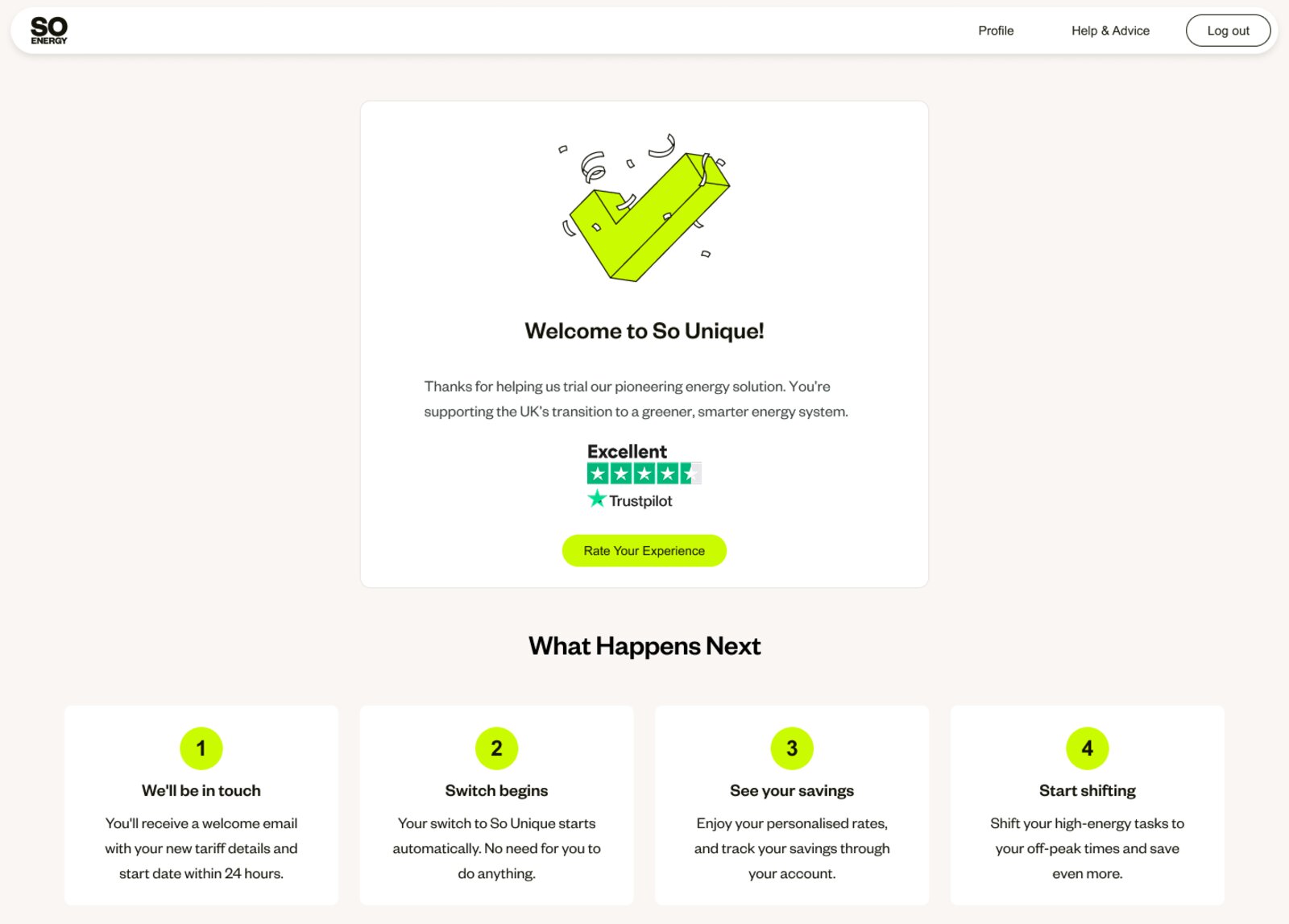
The So Unique trial gave eligible customers their own peak, off-peak and super off-peak rates, calculated from their real smart meter data. I designed and built the full sign-up journey – moving from Figma handoff to an AI-assisted, code-first process to keep pace with a proposition that was still being defined.
The brief
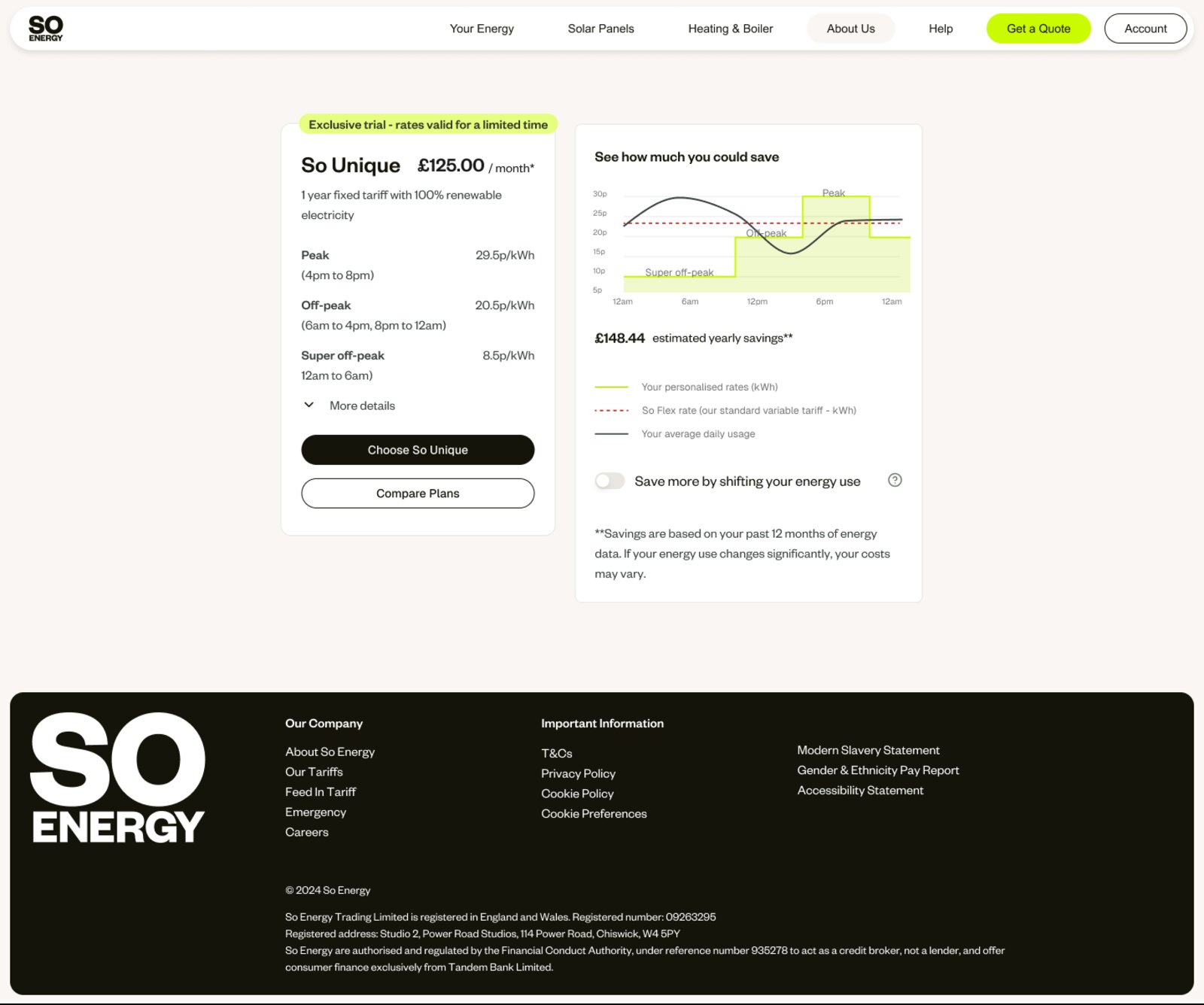
So Unique was So Energy's most ambitious commercial proposition to date – a personalised half-hourly tariff calculated from each customer's actual smart meter data, offering bespoke peak, off-peak, and super off-peak rates designed to reward customers who shift their energy use.
The proposition was genuinely novel. Nothing like it existed in our product line, and because tariffs were calculated individually per customer, the sign-up journey had to communicate complex, data-driven pricing in a way that felt personal and trustworthy – not overwhelming.
I came onto the project in July 2025, following an alpha phase that had validated the core proposition. The brief was to bring a more strategic approach, move fast, and get a beta-ready customer journey live. A small cross-functional team was in place across Propositions, Trading, Engineering, Marketing, and Data, but there was no dedicated front-end resource for custom builds. The usual design-to-development pipeline wasn't going to move quickly enough.
Gauging appetite before building
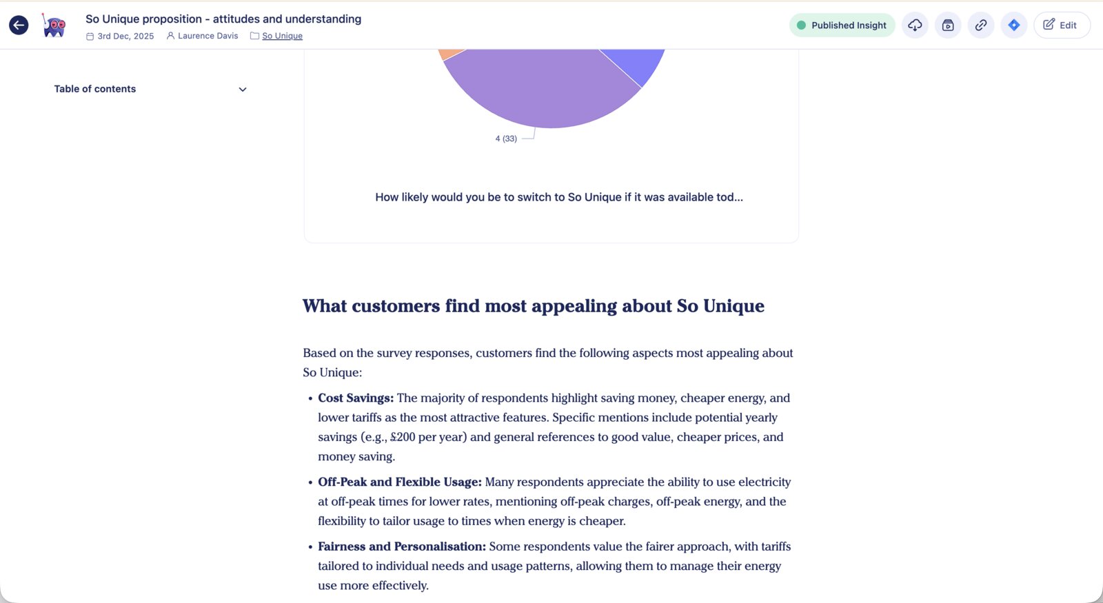
Before starting on the journey design, I launched a Hotjar survey in the customer account to float the proposition and gauge customer understanding and appetite. The results informed how we framed the sign-up experience – particularly around how much technical detail to surface, and which elements of the proposition customers found most compelling versus confusing.
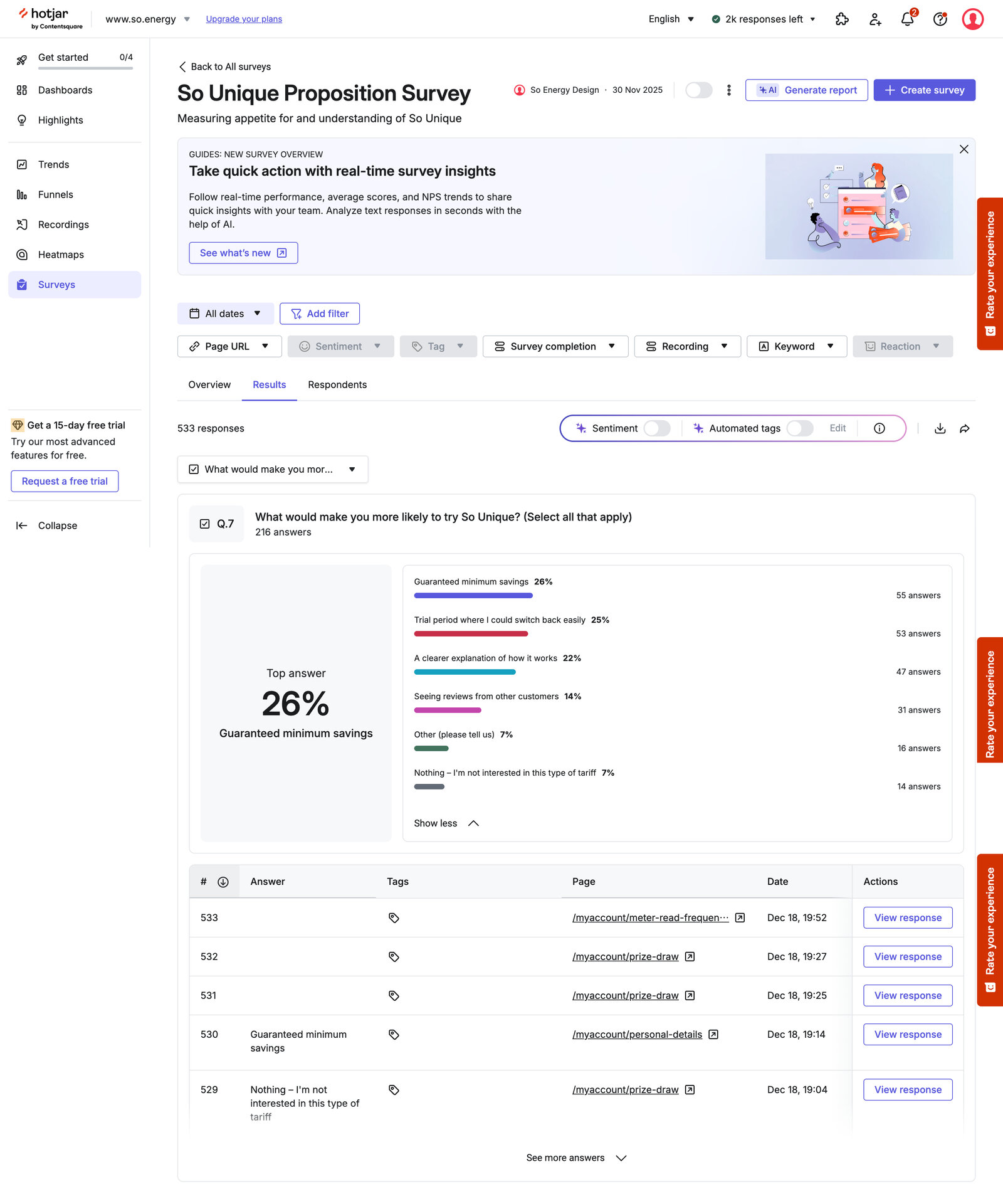
This early data, synthesised alongside wider research in Marvin, shaped the design decisions that followed.
The approach
Rather than following a traditional Figma-to-handoff process, I started by mapping the full onboarding journey and content requirements, then prototyped first in v0 before moving to Builder.io – an AI-assisted environment that let me design and iterate in working code rather than static specs.
This was a deliberate choice. The proposition was evolving in near real-time: Trading were confirming savings models, Marketing were refining copy, and Engineering were working through tariff creation logic. A static spec would have been outdated within days. Building iteratively in Builder.io meant I could respond quickly, share working prototypes directly with the cross-functional team, and work in an environment that connected to our own codebase.
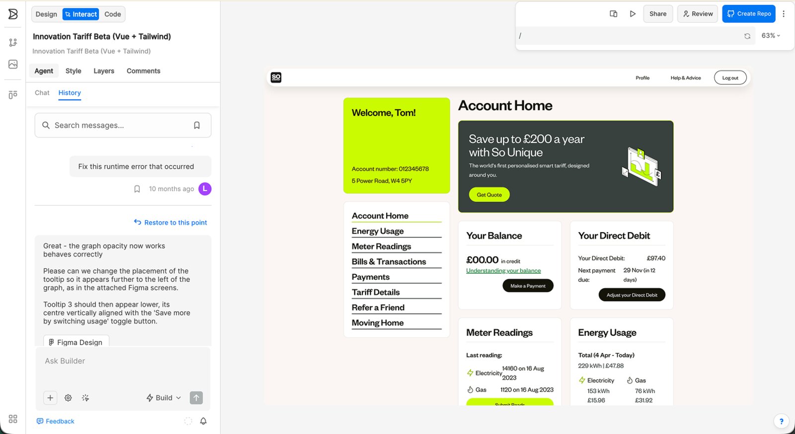
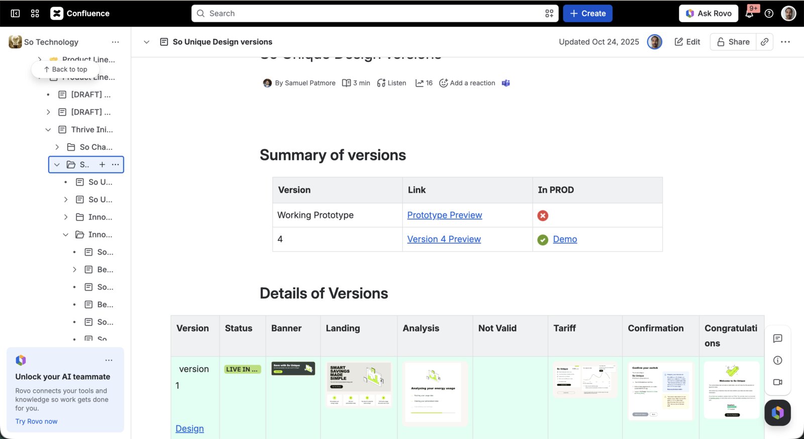
I worked closely with two full-stack engineers to establish a pipeline that pulled code from Builder.io into our own repo and synced with our stack, so design changes I made could be pushed directly to the production environment. This created a source-of-truth challenge for the wider team – it wasn't straightforward for most people to pull up live customer accounts – so we mitigated this by periodically syncing the production screens back to Figma and maintaining a version log in Confluence, tracking every design iteration through to launch.
Once the Figma files were up to date, they also became the primary surface for content collaboration – working with the Senior Copywriter on copy, reviewing SLT feedback on messaging, and managing rounds of sign-off across Legal, Compliance, and Marketing. It was a practical solution that kept design decisions visible to the whole team without requiring everyone to work directly in Builder.
Key design decisions included:
Naming the rate bands
One of my early contributions was recommending plain-English names for the three pricing tiers. We landed on Peak, Off-Peak, and Super Off-Peak – language customers could immediately connect to their daily habits without needing to understand the underlying mechanics.
Balancing personalisation with clarity
The proposition's core appeal was its personalisation, but surfacing too much data risked losing people. I worked with the copywriter and Propositions team to focus the journey on the savings story – what customers could gain by shifting usage – rather than the rate architecture itself.
Usability testing before launch
Prior to the beta going live, I ran a usability study with five Userbrain panel members screened as recent So Energy customers. All five successfully completed the sign-up journey, with an average likelihood-to-switch score of 4.4 out of 5. Key observations shaped the final version: the email needed a clearer CTA, contract length needed more prominence, and the product page could be rebalanced to reduce drop-off before the data analysis step.
Managing a live proposition
Right up to the go/no-go review, SLT feedback prompted content changes – around exit fees, green credentials, savings calculations, and messaging tone. The Builder-to-Figma-to-repo pipeline meant these could be turned around quickly, keeping the journey in step with sign-off processes across multiple departments simultaneously.
Outcomes
The alpha trial had already demonstrated that So Unique successfully drove load-shifting behaviour and beat the Standard Variable Tariff financially. The beta confirmed this at scale: customers achieved annual savings ranging from £52 to £480 against the SVT, with an average of £186 per year. Customers who shifted usage most actively – particularly into super off-peak periods – saw the greatest benefit.
A waiting list of 1,359 sign-ups built during the beta phase (1,035 existing customers and 324 non-customers), demonstrating strong appetite even with a tightly controlled eligibility pool. Recruiting customers for follow-up research interviews proved challenging given the small sample size, but the qualitative feedback we did gather – alongside the quantitative data – provided valuable learnings that are now shaping the next phase of the proposition, which is gearing up for a wider release.
The approach also demonstrated something with broader implications for the team: that a single designer, working with AI-assisted tooling and a clear brief, could design and deliver a commercially ambitious, personalised customer journey from scratch to live in under three months – without a dedicated front-end resource.
What I learned
So Unique showed how much is possible when design moves closer to delivery. The Builder.io-to-repo pipeline compressed a process that would normally involve multiple handoff stages into something much more direct – and that directness had real quality benefits, not just speed ones. When you're iterating in the same environment the product is built in, decisions stay grounded in what's actually possible.
It also required a different kind of discipline. Moving fast with AI tooling makes it easy to lose consistency or let quality slip in the details. Maintaining Figma as the visible collaboration layer – and the Confluence version log as the audit trail – meant the wider team stayed informed and aligned even when the build environment wasn't accessible to them.
It's also worth noting that the approach itself was experimental, not a repeatable playbook. Around the same time as So Unique, we'd begun exploring Claude Code as an alternative way to ship features fast, and that has since proven the more viable route for us. We haven't built anything else in Builder.io since – but the experiment was valuable: it unblocked us, showed what was possible with AI-assisted tooling at the time, and helped shape the AI-integrated approach to product development we use today.
Perhaps most importantly, it reinforced that the right tool choice at the start of a project can change what the project is capable of.